
Cafe Brasil
Cafe Brasil is a brand built around more than just coffee, is about creating an experience rooted in the warmth and vibrant energy of Brazilian and latin traditions. Creating something meaningful and immersive.
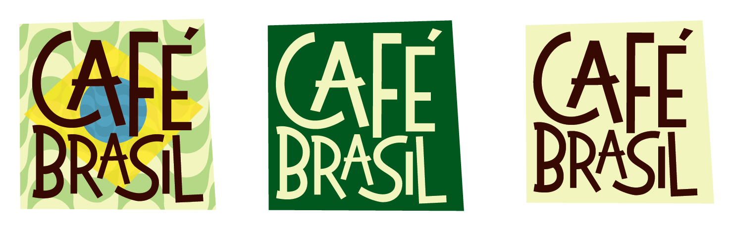
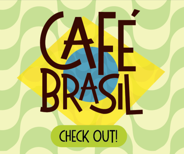
The logo is simple and adaptable, showing flexibility and showing its boldness in different ways. Fun typography expressing its playful personality, with a asymmetrical square bring that fun and clever feel.
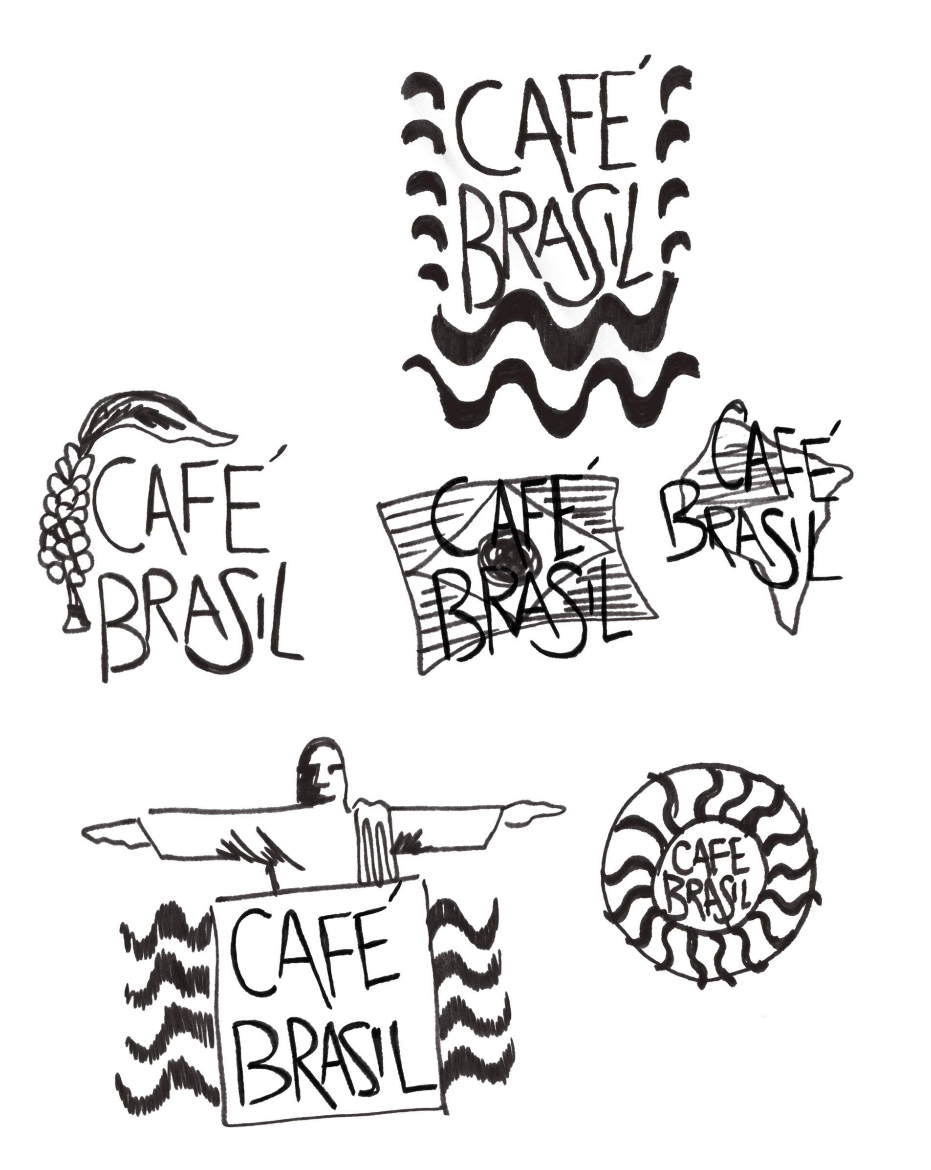
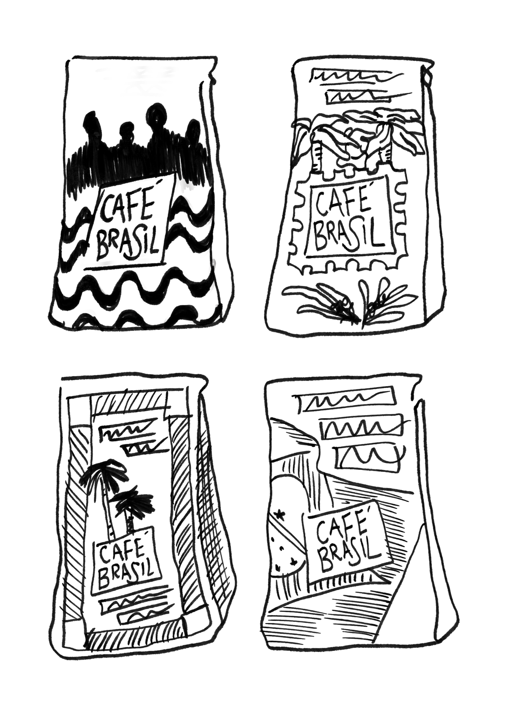
From there, I move into quick sketching and explore as many ideas as possible. I then step away, come back with fresh eyes, and refine my strongest concepts.
When I started Cafe Brasil, I began with research. Sometimes an idea clicks right away, but I still use research to ground it and make sure the concept has purpose and direction.
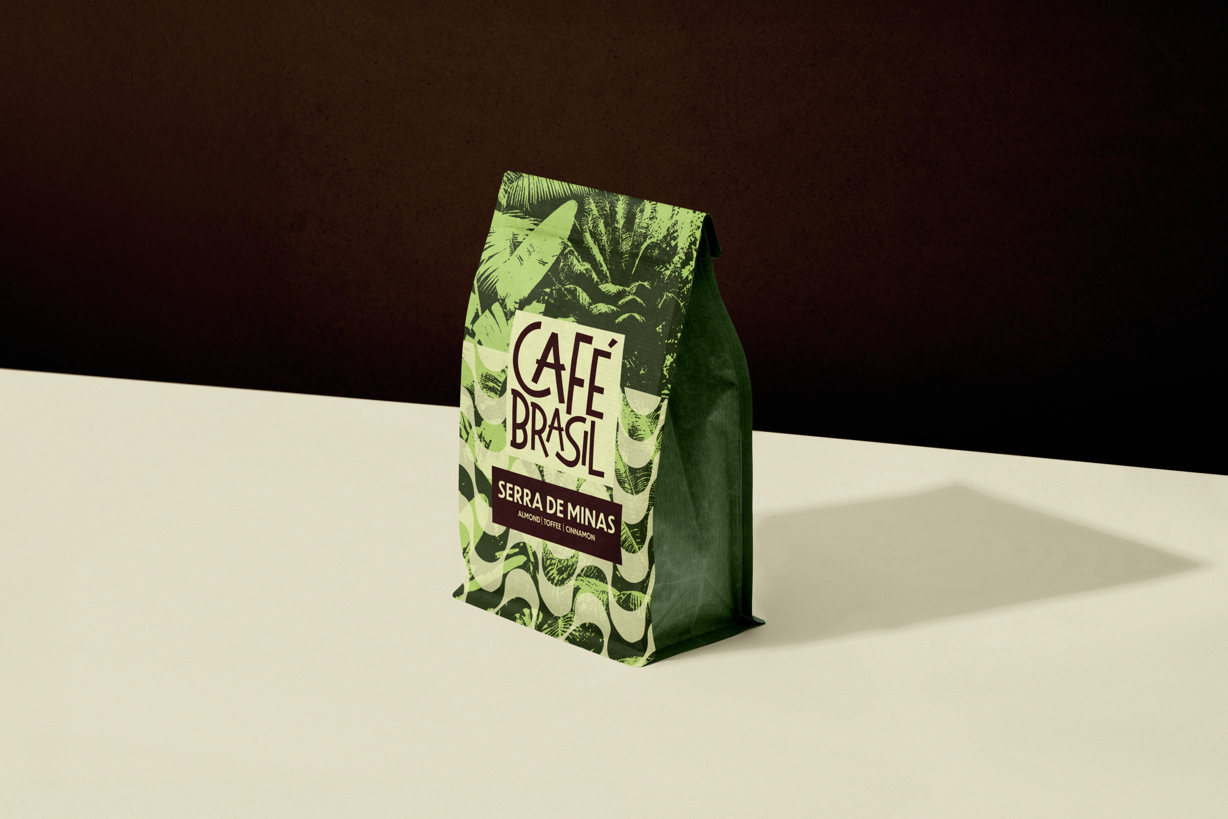
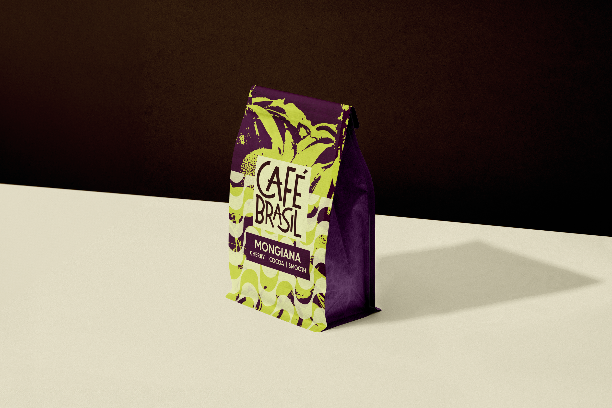
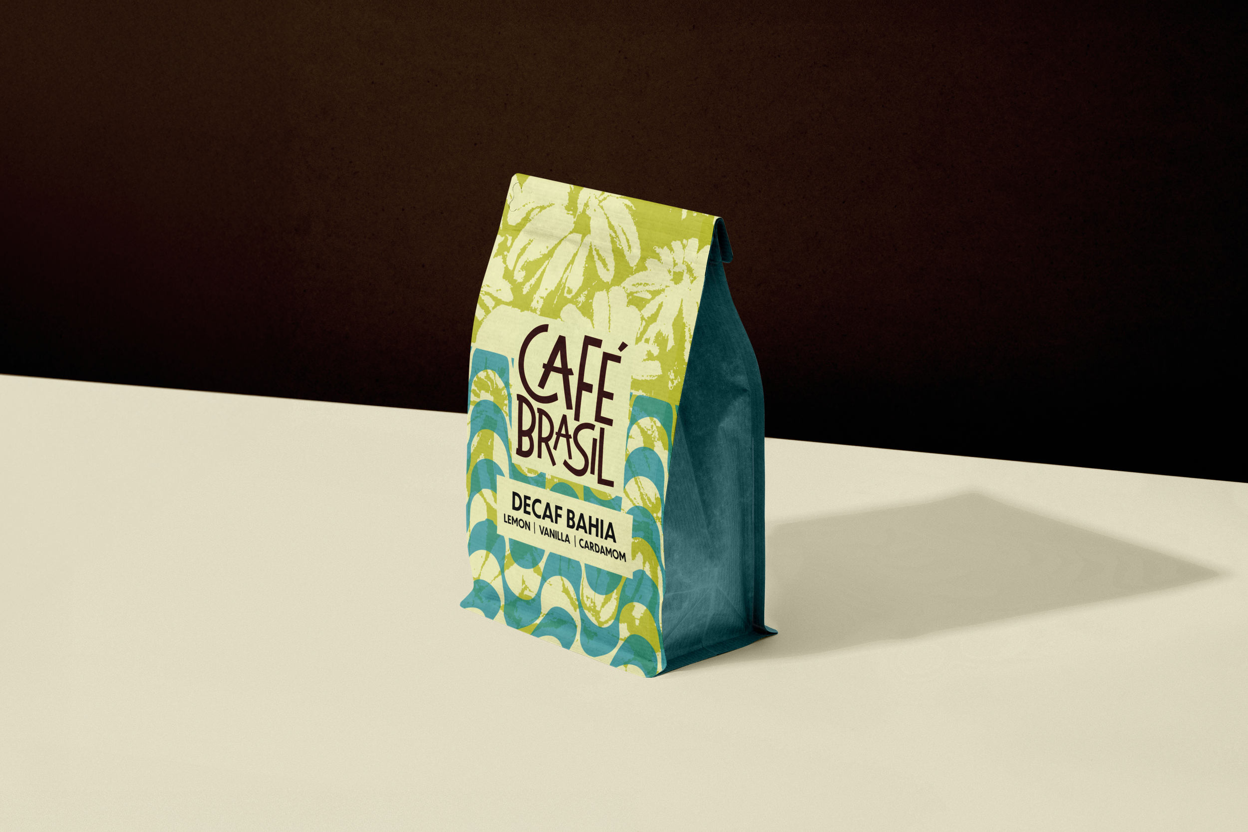
Playful, fun design with a tropical look tying back to the Brazilian culture. Using bold colors combining the fun logo with clean type.
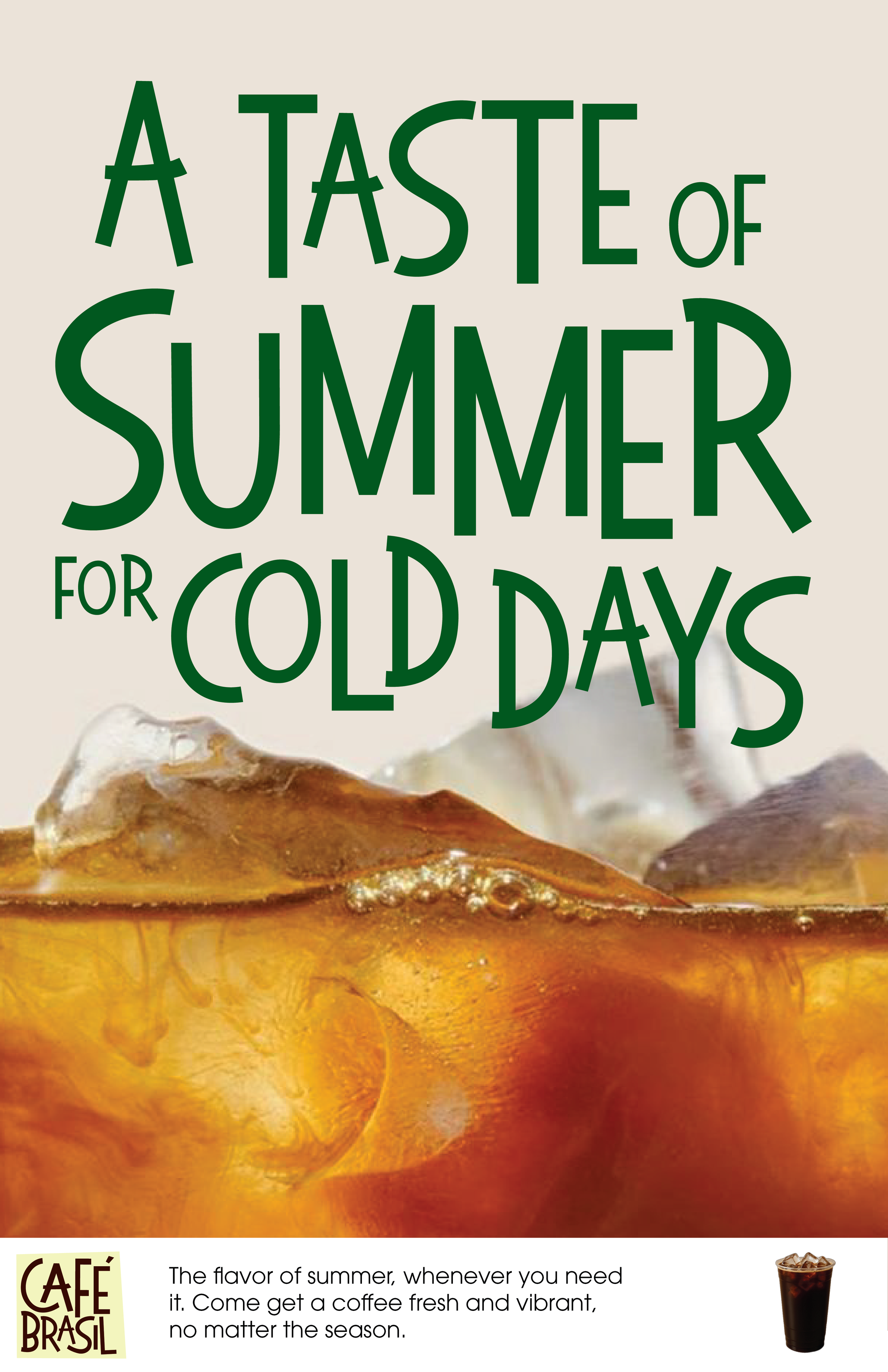
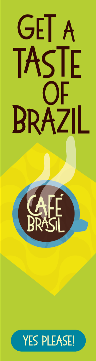
The ads represents the warmth and fun of brazil, the purpose is to bring that fun to you. Get a break from winter and come enjoy the warmth of our culture.
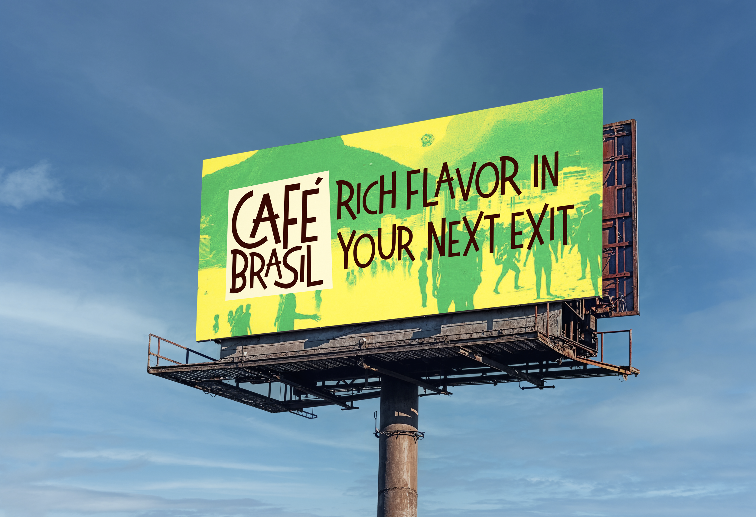
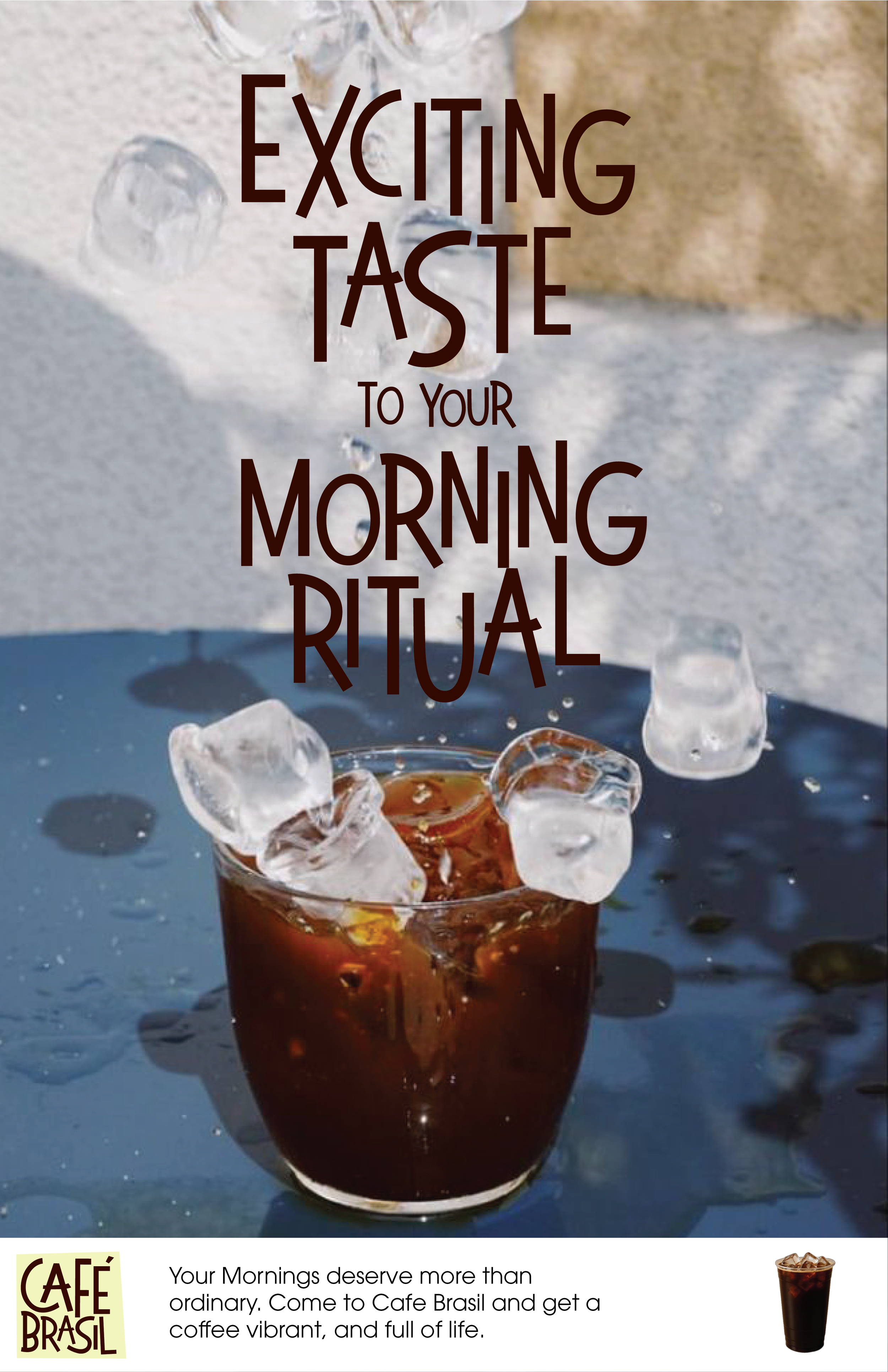
Playful font and bold colors are the core of the brand, translating the playfulness and warmth from the brand. A Vibrant and flavorful coffee is waiting for you, just a couple miles away from you.
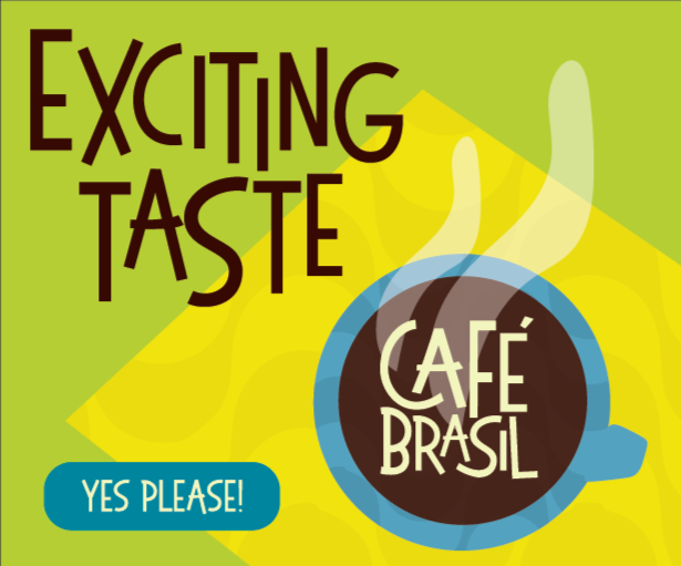
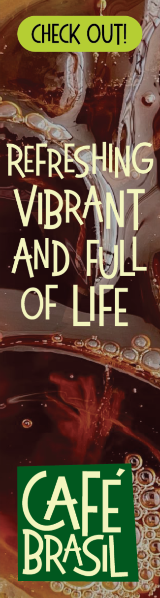
Bold colors with fun typography, bring the excitement and eye catching character Cafe Brasil have. The OLAs have a mix of illustration and close up images, expressing the fun of the brand but also showing its delicious coffee.